
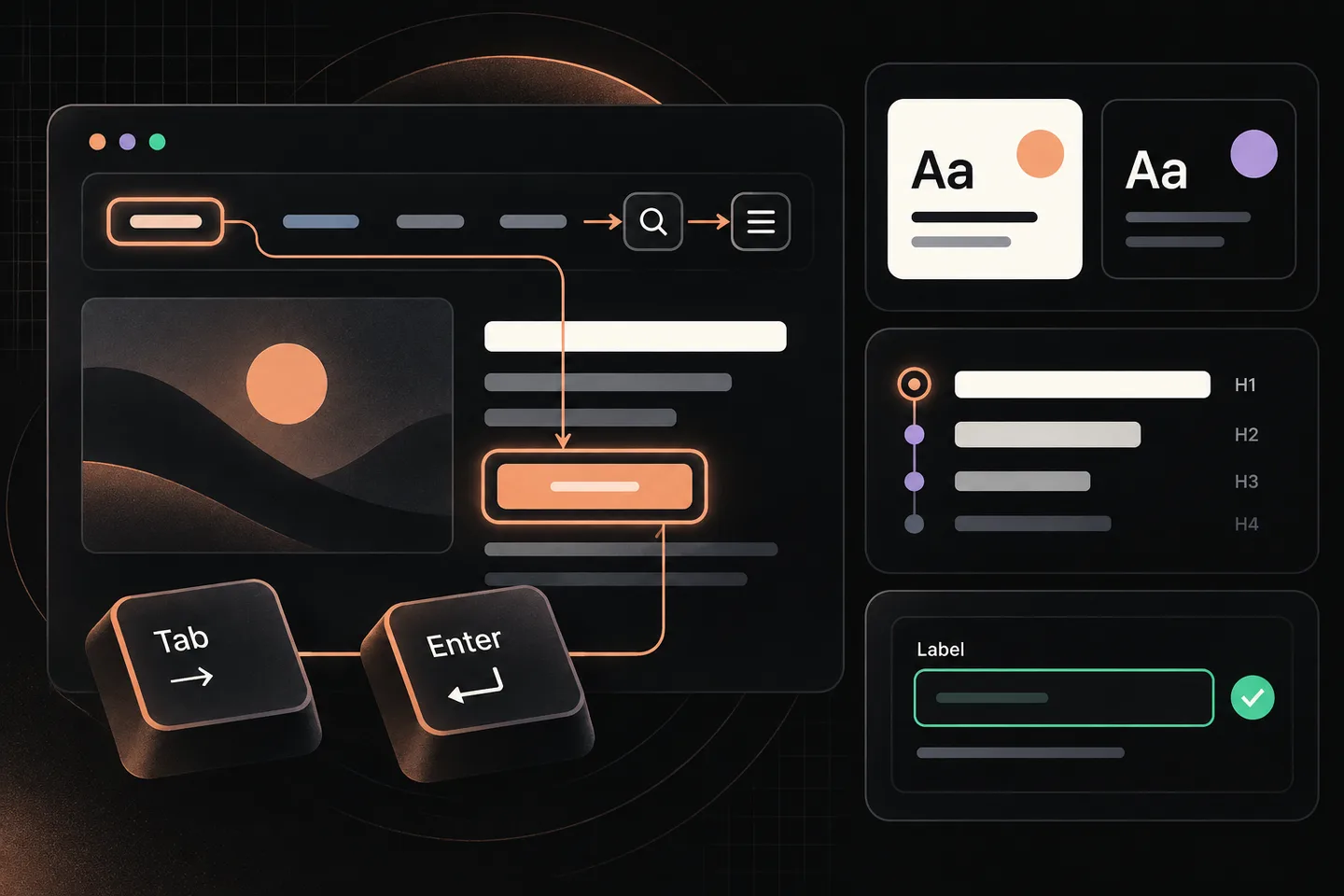
A theme can look finished in a preview and still leave visitors unable to open its menu, follow a visible focus indicator, or understand a form error. The useful question before launch is not whether the theme has an accessibility label. It is whether people can use the pages you intend to publish, with your navigation, content, colours, and plugins in place.
Choose pages that expose the theme’s real behaviour
Begin with a short route list: the home page, one standard page, one article, an archive or search page, and a page with a form if the site will have one. Add any page with a distinctive layout, such as a landing page or a page with a sidebar. Record the exact URL and the template or layout used. A shared header may behave consistently across routes, but headings, images, cards, and forms will vary with the content.
Test after applying the settings you expect to launch: fonts, colour palette, logo, menu structure, and representative content. If the theme uses the Site Editor, include pages that use edited templates and template parts. WordPress explains that block themes can place navigation, headers, content, and footers in blocks and allow templates and shared parts to be edited. A change to a shared header can therefore affect several routes, while a problem in one post may belong to its content alone.
Keep a desktop-width and a narrow-width view in the test. Resize the browser as well as checking on a phone-sized viewport: a menu that works in the wide header may become a different control at a narrower width. Note the browser and viewport used so someone else can reproduce the result.
Test every journey with the keyboard
Load each route, put the pointer aside, and begin at the top with Tab. Use Shift+Tab to travel backwards. Follow the focus through the skip link, logo, main navigation, search, page content, and footer. Ask two questions at every stop: Can I tell where I am? and Can I use this control? The W3C Web Accessibility Initiative’s preliminary checks call for a logical focus order, visible focus, and access to functionality without a mouse.
Try the skip link if the page has one. It should become visible when focused and take you to the main content. Open menu and submenu controls with the keyboard, move through their links, then close them. Use the key indicated by the control’s behaviour; do not assume every navigation pattern uses the same keys. Check that opening a submenu does not send focus somewhere unexpected, and that you can leave it without becoming trapped. Repeat these steps when the mobile menu replaces the desktop navigation. A pointer-only hover menu is a launch issue even if its links work perfectly with a mouse.
Watch the focus indicator against every background it crosses. It should remain easy to see on light and dark sections, inside menus, and on buttons and links. Do not judge focus from one screenshot: follow it through the actual sequence. For a form, reach each field, option, and submit button; send an incomplete test submission and check whether the error can be found and understood. WordPress’s theme accessibility handbook specifically calls for keyboard-usable controls at all screen sizes, including menu and submenu buttons, and for labels and perceivable form responses.
Finally, test any interface added by a plugin or by your content: accordions, filters, popups, or expandable tables. Record these separately from theme defects when ownership differs. Visitors experience the assembled page, so a working theme menu cannot compensate for an unusable form below it.
Inspect what the page communicates
Read the page without relying on its visual styling. Is there a clear page title? Do headings describe the sections beneath them, and do their levels form a sensible outline? A large, bold line is not necessarily a heading in the page structure. Compare the visible sections with a headings view in browser developer tools or an accessibility checker, then correct the content or template that produced the mismatch. The W3C’s preliminary review includes checking that visible headings are marked as headings and that the hierarchy makes sense.
Review links in context and out of context. “Read more” repeated across a card grid tells a reader little when links are listed separately; link text should identify the destination or purpose. Check that links within paragraphs can be recognised without depending on colour alone. Inspect hover and keyboard focus states too. If a whole card is clickable, confirm that its link can be reached, identified, and activated from the keyboard.
Check every meaningful image on the selected pages for a useful text alternative. The right text depends on the image’s purpose on that page. An image that conveys information needs an alternative that conveys it; a purely decorative image should not force a redundant description on the reader. Inspect featured images and icons as well as images inside articles. A checker can reveal a missing alt attribute, but a person must decide whether the supplied words communicate the image’s purpose.
For forms, verify that each input has a label that remains clear when the field contains text. Placeholder text alone is a poor substitute. Check required-field instructions, grouped choices, and error messages on the rendered page. For text and controls, inspect colour contrast in the combinations visitors will actually see: normal text, muted text, links, buttons, placeholders, error states, and text over images or coloured panels. Use a contrast-measuring tool for the colours, then visually inspect the resulting page. The WordPress handbook describes contrast, links, image alternatives, headings, and labels as separate accessibility concerns; passing one does not settle the others.
Use automation to find candidates, then verify them manually
Run an automated accessibility checker on each selected route after the manual pass. Save its findings with the route, and inspect each reported element in the page. Automated checks can help locate missing labels, structural errors, or measurable contrast problems. They cannot tell you whether the mobile menu makes sense to operate, whether an image description fits its context, or whether a focus path is comfortable to follow.
Understand what “accessibility-ready” tells you
The WordPress theme directory’s accessibility-ready label is a useful screening signal. It is not a statement that the finished site conforms to WCAG at AA level. WordPress says its accessibility-ready requirements are minimum theme-review standards adapted from WCAG, rather than full AA conformance. Your chosen palette, edited templates, navigation, article images, plugins, and forms all affect the pages visitors receive.
Keep a small issue log that leads to a fix
A useful log needs more than “menu inaccessible.” For each issue, record its impact, route, reproduction steps, and owner. Add the expected behaviour and the observed behaviour so the person fixing it can confirm the same result. For example: “High impact; /services/; at narrow width, Tab to Menu, press Enter, then Tab through submenu; focus moves behind the open panel; owner: theme developer.” If ownership is uncertain, assign someone to investigate rather than leaving the field blank.
Prioritise issues that block navigation, reading, or form completion. Keep lesser problems visible, but distinguish them from blockers. After a repair, note the date and retest the exact route and steps. A closed issue should mean the interaction was checked again, not merely that a code change was made.
Copy this page-level test sheet
Use one copy per route. Mark each check pass, issue, or not present, and add a brief note.
- Context: Record the URL, template, browser, viewport, and relevant settings.
- Keyboard path: Tab forward and backward; check order and traps.
- Focus and skip link: Follow visible focus and activate the skip link if present.
- Navigation: Open, traverse, and close wide and narrow menus and submenus.
- Content: Compare headings with the page outline and read link text out of context.
- Images and colour: Review alternatives in context and measure key contrast combinations.
- Forms and added controls: Check labels, keyboard use, instructions, and an error state.
- Automated review: Record the checker, date, findings, and manual verification.
For any issue, record impact, URL, reproduction steps, expected and observed behaviour, an owner, and the retest result. Repeat the relevant checks after changing the theme, templates, navigation, plugins, or content.