
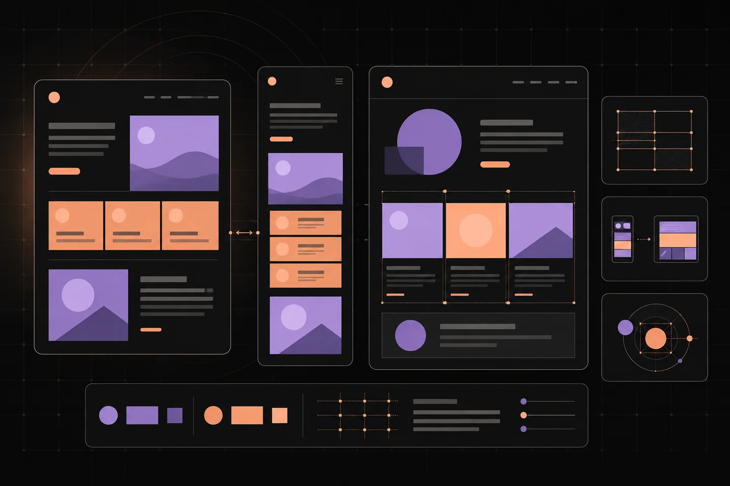
A useful website theme must do more than produce an attractive homepage. It needs to accommodate your actual content, remain readable on small screens, and give editors controls they can understand. Start by deciding what visitors need to find and what you need to publish. Then compare themes against those tasks, using the same sample pages for each candidate.
Define the pages you need
List your main content types before browsing a theme catalogue. A portfolio may need project galleries and case studies; a publication needs article pages and archives. A service website needs clear descriptions and an obvious next step. Identify which layouts are essential and which would merely be convenient.
Prepare a small sample containing a long article, a short information page, several images with different proportions, and your intended navigation labels. Include an unusually long headline. Demo photographs and carefully balanced text can hide weaknesses that become obvious with ordinary material.
Check whether each theme handles these examples without special treatment. A project grid should accommodate uneven descriptions. An article should remain readable without a large opening image. If every page needs manual spacing adjustments, the theme may create more editing work than its preview suggests.
Choose an editing model
Theme systems offer different levels of control. A block-based approach can let editors assemble page sections and adjust shared areas such as headers and footers. A template-based approach may expose a narrower set of settings while keeping structural changes in files. Test the actual controls rather than choosing by the label alone.
For background on one editing model, WordPress’s block theme documentation explains how this editing model works. Use documentation to identify the tasks you would perform regularly, then try those tasks on a private installation.
Change a heading style, replace an image, add a menu item, and edit a shared footer. Check whether the change affects one page or the whole site. Broad control is useful when you need it, but it also increases the chance of inconsistent layouts. Editors who mainly publish articles may prefer fewer structural choices.
Inspect typography and page structure
Read several paragraphs at a normal viewing distance. Body text should be comfortable without zooming, headings should create a clear hierarchy, and links should be distinguishable from surrounding copy. Check captions, lists, quotations, and metadata as well as the main text: these smaller elements often reveal incomplete styling.
Examine spacing between related elements. A caption should belong visually to its image, while a new section needs enough separation to be recognisable. Consistent spacing is more useful than a large catalogue of decorative effects. Animation and overlays should have a clear purpose and should not obstruct reading or navigation.
Inspect an article, archive, search result, information page, and missing-page response. Test empty states where possible. A theme that only looks convincing on the homepage leaves you to solve the less prominent pages yourself. Look especially for truncated headings, stretched images, and unexplained gaps.
Check narrow screens with real content
Resize the browser gradually instead of checking only a desktop and phone preset. Watch where columns collapse and whether navigation labels wrap awkwardly. Long words, captions, and multi-level menus can expose problems that a clean demo conceals.
On a touch screen, try opening the menu, following a link, and returning to the previous page. Controls should be easy to distinguish and operate without accidentally selecting a neighbour. Check whether fixed headers or floating panels cover headings and whether the page requires sideways scrolling.
Repeat these checks after adding your own images. A layout may depend on a particular crop, so inspect what happens to faces, text within images, and other important details. Choose a theme whose image treatment suits your material rather than assuming every photograph can be cropped identically.
Keep content separate from presentation
The theme should chiefly handle layout, typography, colours, and templates. Features such as bookings, memberships, forms, and commerce need separate evaluation. Before accepting bundled features, establish where their data lives and what happens when the theme is deactivated.
On a test copy, switch to another theme and inspect your content. Look for visible shortcode fragments, missing project descriptions, or information that can no longer be edited. Some layout changes are expected; losing access to essential content is a more serious dependency.
Read demo-import instructions before running them. Find out whether the import creates pages, changes menus, or installs additional components. Keep a record of required additions and remove unused demo material after testing. A large options panel is not evidence that the resulting site will be easy to maintain.
Test accessibility as part of the shortlist
The Web Content Accessibility Guidelines 2.2 provide testable criteria for accessible web content. Use them as a reference when examining navigation, text contrast, focus visibility, and page structure. A theme's accessibility description does not establish that your finished pages are accessible.
Put the mouse aside and navigate with the keyboard. Confirm that you can see which control has focus, open and close menus, and reach the main content. Check that focus does not become trapped in a panel and that the order follows a sensible reading sequence.
Increase text size and inspect the result. Content and controls should remain usable without overlap or clipping. Forms need meaningful labels, and headings should describe the sections beneath them. Your own copy, image alternatives, and content structure remain part of this work.
The block theme accessibility guidance offers further background on landmarks and skip links. Look for these mechanisms in your candidate, then test their behaviour rather than relying solely on a feature list.
Review maintenance and customisation
Look for installation instructions, a readable changelog, compatibility information, and an explanation of how updates work. Check whether the documentation covers the editing tasks you need. A polished preview cannot answer these questions.
The WordPress Theme Directory’s guidance provides context for evaluating a directory listing. Wherever you obtain a theme, read its licence and support terms directly. Do not infer maintenance arrangements from its appearance or assume that optional extensions follow the same terms.
Record the version you test, its required components, and any custom changes. Direct file edits may be overwritten by updates, so identify the supported customisation method before making them. Keep a restorable copy and rehearse updates privately before applying them to the public site.
Make the final comparison
Shortlist three candidates and run the same checks on each. Note concrete problems rather than giving vague impressions: “menu cannot be closed by keyboard” is more useful than “navigation feels poor”. Distinguish a configurable preference from a defect that requires code changes.
- Can you publish your main content types without repeated workarounds?
- Do long headings, mixed image shapes, and dense articles remain readable?
- Can visitors navigate with a keyboard and on a narrow screen?
- Does essential content survive a theme change?
- Can you explain how customisations and updates will be maintained?
Choose the candidate with the fewest unresolved obstacles to your actual publishing work. Before building the remaining pages, establish shared text styles, spacing, and image conventions, then publish representative content on the test site. Resolve any failures there while the cost of changing direction is still small.